Increasing client retention through a clarity-driven financial dashboard

Small business owners struggled to understand their financial performance. The product focused on listing transactions, which led many clients to export data into spreadsheets just to make sense of it. As a result, support requests increased and churn remained high.

The issue wasn’t a lack of data, it was a lack of actionable insight. That realization led to designing a focused dashboard that surfaces the metrics that matter most and helps business owners make faster, more confident decisions.
Role
Product Designer
Sole Designer
Team
1x Product Manager
2x Engineers
Impact
Enabled faster financial decision-making for small businesses
Supported product team in validating product market fit
Increased client retention through an actionable dashboard
Reduced post-launch support requests
Problem area

Small teams, overwhelming financial complexity

Small businesses were buried in financial data spread across multiple tools and spreadsheets. Without clear, prioritised insights, decisions became slow and reactive, leading to missed opportunities and unnecessary costs. Internally, this resulted in rising support requests, low product adoption, and declining client trust.

Product before redesign

Opportunity 1

Small businesses of any size need a simple way to see their financial health without exporting data or relying on spreadsheets.

Opportunity 2

An all-in-one financial dashboard that surfaces clear, actionable insights instead of raw transaction lists.
Design goals

What I aimed to achieve

Simplify decision-making

Turn complex data into clear, actionable insights that drive business decisions.

Build trust

Design a clear, reliable dashboard that keeps business owners in control.

Increase adoption

Introduce a safe testing space where users can explore value, see quick wins, and engage without commitment.
Design decision 01

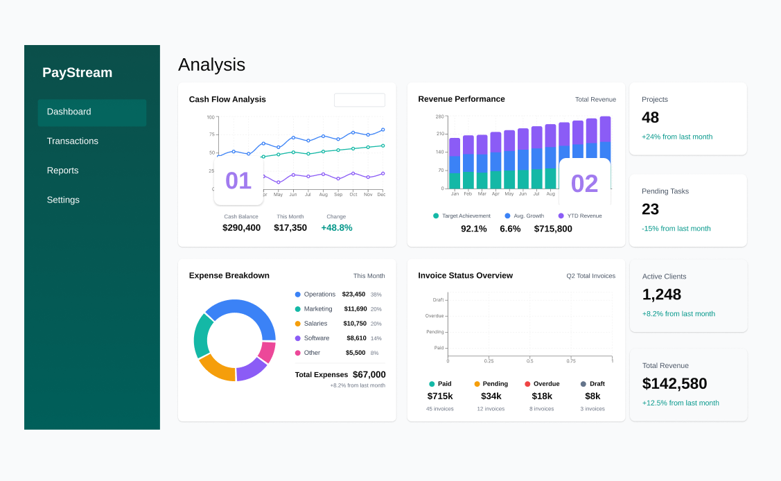
Defining KPIs that actually drive decisions

Early interviews revealed that small business owners care about profitability and stability, not vanity metrics. Instead of overwhelming them with detailed reports, I focused the dashboard on three core signals: cash flow, overdue invoices, and revenue growth.

This required trading analytical depth for clarity, but it enabled faster insight scanning, more confident decisions, and stronger long-term retention.

Top KPIs selected

Monthly revenue

A clear snapshot of business growth and overall performance.

Cash flow trend

Highlights financial stability and signals potential future risk.

Overdue invoices

Surfaces delayed payments early to protect cash position.

Revenue vs target

Keeps business goals visible and progress measurable.
Design decision 02

Building trust through a sandbox mode

Many users dropped off before connecting their financial data. Rather than forcing onboarding, I introduced a sandbox environment that allowed them to explore the product immediately.

This reduced friction at entry, demonstrated value early, and built confidence before asking for commitment.

Top KPIs selected

1. Testing mode indicator

Reassures users they’re exploring in a safe, no-commitment environment.

2. Context message

Clarifies that real financial data isn’t being used, reducing hesitation and anxiety.

3. Upgrade banner

Encourages activation by clearly communicating value and next steps.
Design decision 03

Choosing clarity over complexity in data visualisation

I explored two directions: a chart-heavy layout and a minimalist, insight-led approach. I chose simplicity because financial data requires precision and fast scanning, not visual noise.

The cleaner structure made key signals immediately visible, improved comprehension, and strengthened trust in the product, particularly at a time when retention was declining and customers were disengaging.

What I learned testing: charts were too complex

Top KPIs selected

Learning 01

Competing metrics made it difficult for business owners to identify what truly required attention.

Learning 02

Overloaded charts slowed comprehension, delaying decisions in moments that required speed and precision
Retrospective

Designing for confidence, not financial expertise

Before redesign

After redesign

Impact

Empowered businesses

Business owners gained control by tracking performance in minutes and making faster, more confident decisions.

Increased retention

The dashboard became a central product touchpoint, driving engagement and significantly reducing support requests.

Increased efficiency

It cut design time from weeks to days, letting the team test, refine, and deliver faster.Reduced design cycles from weeks to days, enabling faster testing, iteration, and delivery.

Krystian

Leave your email and I’ll reach out.
Your information will only be used to reply to your enquiry. privacy policy.
Thank you! Your submission has been received!
Oops! Something went wrong while submitting the form.
© 2025 Krystian Kowalczyk