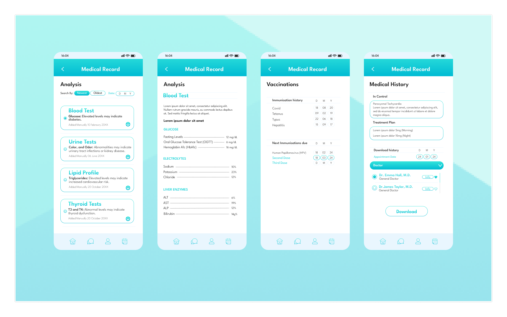
Healio — Private Healthcare App

A private healthcare app that simplifies appointment booking, test results, and ongoing care through clear, user-centred design.

Role: UX/UI Designer
Project type: Digital health product design case study
Focus: Research-led redesign

1. The Problem

Booking appointments, managing changes, and accessing medical results often feels fragmented and time-consuming. Users rely on phone calls, unclear processes, and disconnected systems, which leads to frustration, missed information, and a lack of control over their own healthcare.

To understand user needs, the project used interviews, competitive analysis, and usability testing. The research focused on how people book appointments, manage changes, receive results, and what builds trust in a private healthcare app.

2. Research & Discovery

3. Key Insights

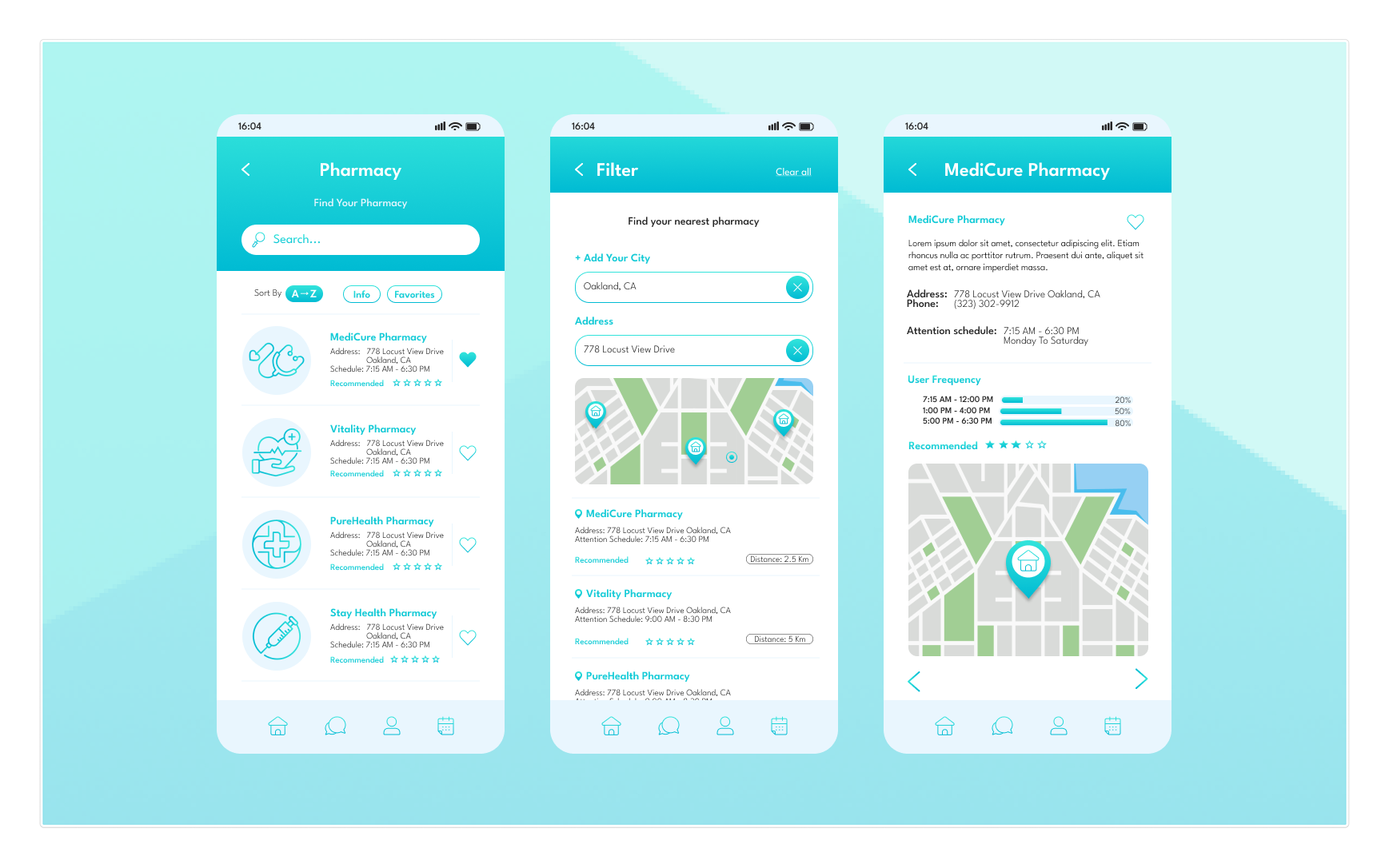
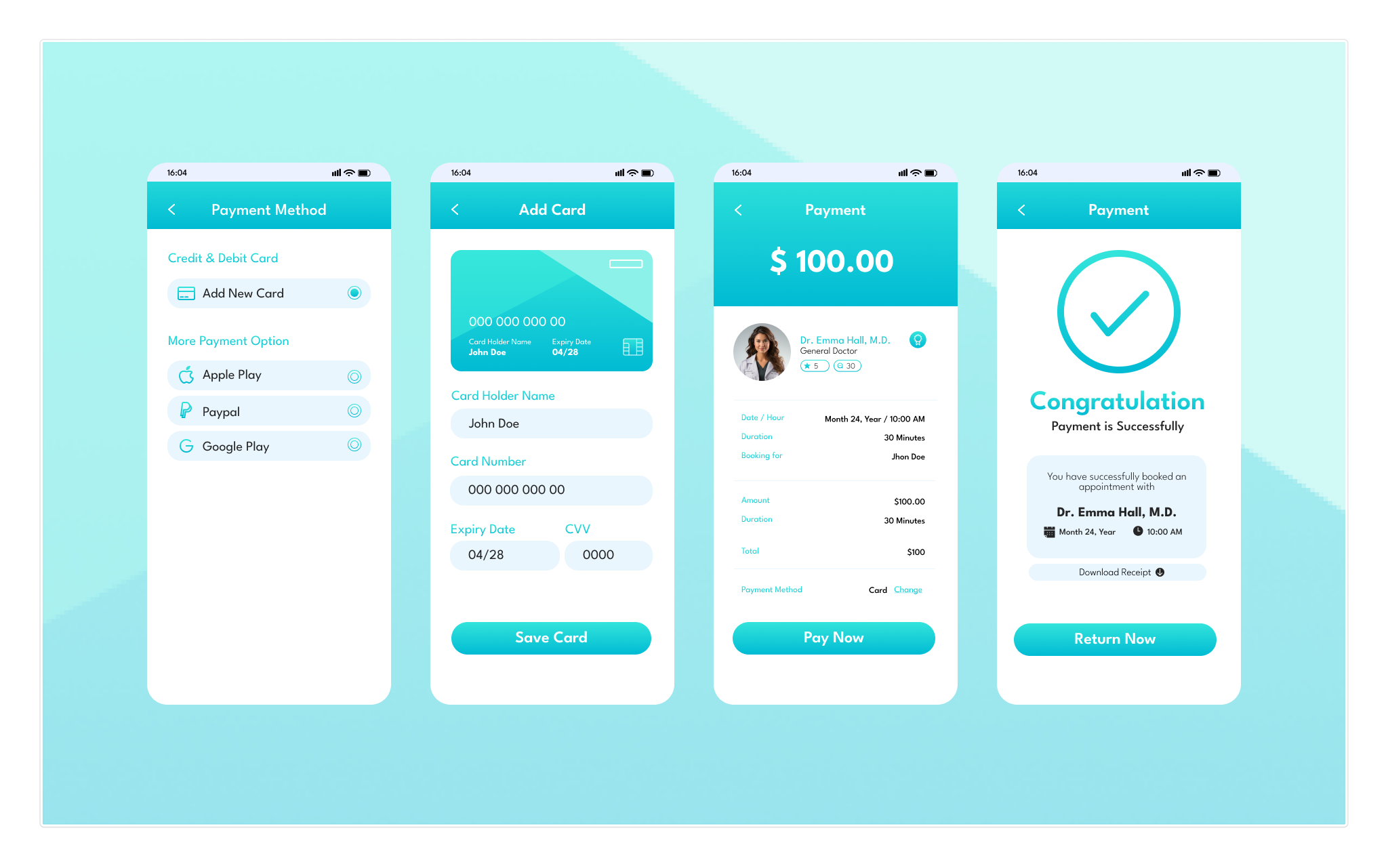
Users want to book and manage appointments without phone calls, receive clear and timely reminders, and access test results in plain language. Trust is built through transparency, consistency, and clear data-privacy cues throughout the experience.

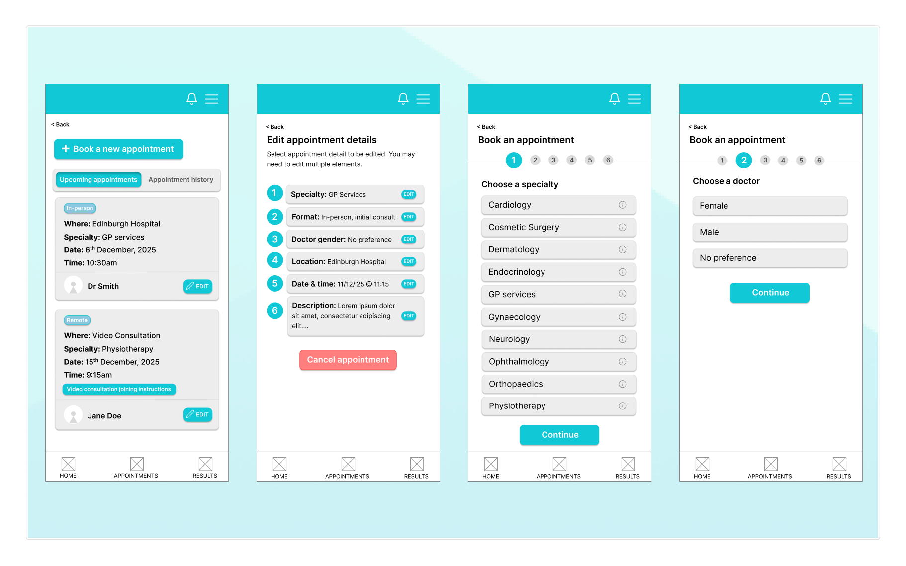
Based on the research, the app needed to give users more control over their healthcare by simplifying booking, making key actions easy to find, and presenting medical information in a clear, reassuring way. The focus was on reducing friction, confusion, and anxiety at every step.

4. Define the Problem Space

5. Solution Direction

Healio was designed as a mobile-first private healthcare app that brings booking, appointments, and results into one clear flow. The solution focuses on step-by-step booking, easy appointment management, and results explained in plain language, supported by consistent navigation and visible trust cues.

6. User Flows

Healio was designed as a mobile-first private healthcare app that brings booking, appointments, and results into one clear flow. The solution focuses on step-by-step booking, easy appointment management, and results explained in plain language, supported by consistent navigation and visible trust cues.

7. Design Iterations

Early concepts were tested and refined through usability feedback. Changes focused on simplifying the booking steps, improving visibility of key actions like editing appointments, and restructuring how results are presented so users see a clear summary before detailed information.

8. Final Screens

The final interface presents a clean, mobile-first experience focused on booking appointments, managing visits, and reviewing results. Screens prioritise clear hierarchy, simple navigation, and plain-language content to reduce friction and support user confidence.

Login, Sign Up (Authentication)

Specialties Doctor

Doctor, Favorite Screens

Appointment

Medical Records

Pharmacy

Payment