Patients struggled with fragmented booking, unclear results, and reliance on phone calls.
Problem area
Booking appointments, managing changes, and accessing test results often required phone calls and navigating disconnected systems.
This fragmentation reduced patient control, increased anxiety around medical information, and weakened trust in a private healthcare service.
User Journey Exploration & Early Wireframes
Opportunity 1
Booking appointments, managing changes, and accessing test results often required phone calls and navigating disconnected systems.
Opportunity 2
This fragmentation reduced patient control, increased anxiety around medical information, and weakened trust in the overall healthcare experience.
Design goals
Design a mobile-first healthcare experience that:
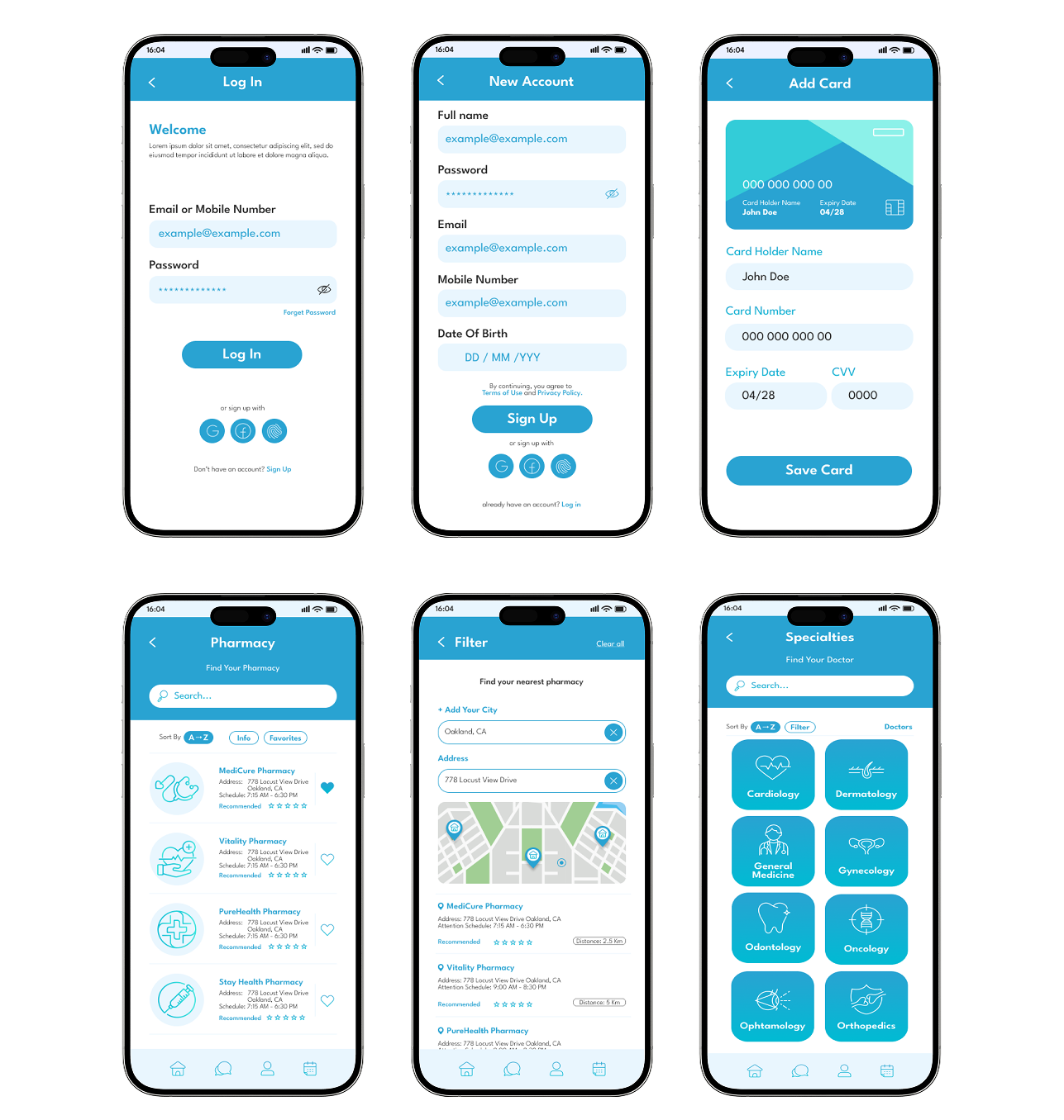
Removes phone dependency
Digitises core flows so patients can manage care independently without relying on support channels.
Explains medical results in plain language
Prioritises summary-first communication to reduce anxiety before exposing detailed clinical data.
Builds trust through transparency
Uses consistent navigation, visible privacy cues, and predictable system behaviour to reinforce reliability.
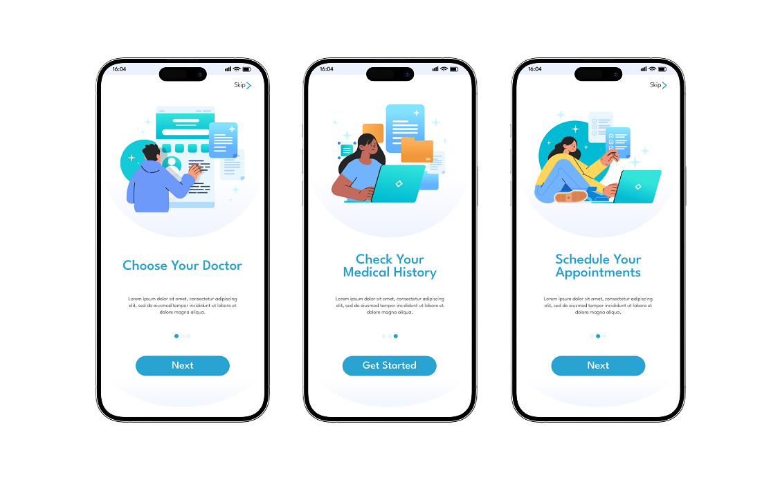
Simplifies booking and appointment management
Structures interactions into clear, step-based actions that reduce hesitation and decision fatigue.

.png)
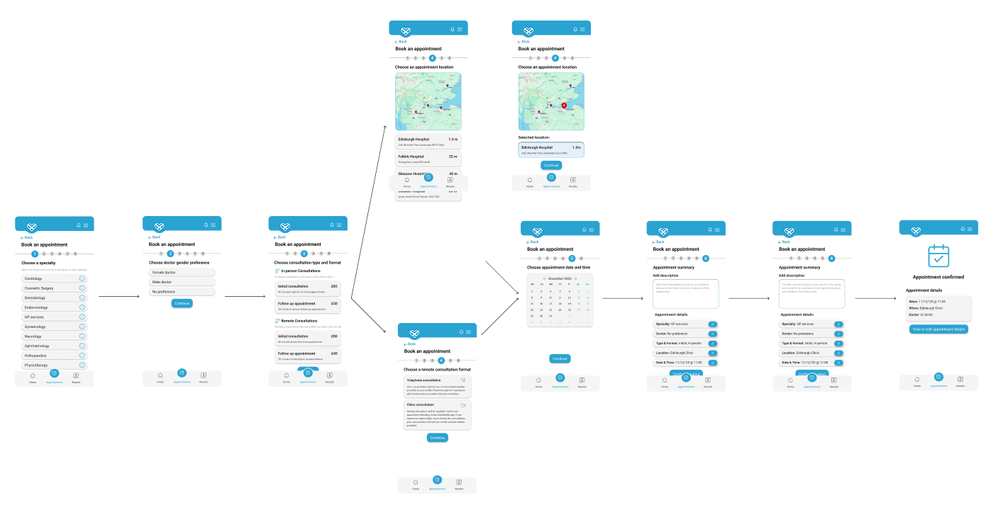
Design decision 01
Step-by-step booking flow
Step-by-step booking flow
Step-based booking flow
Breaks complex scheduling into guided stages, reducing cognitive load and drop-off.
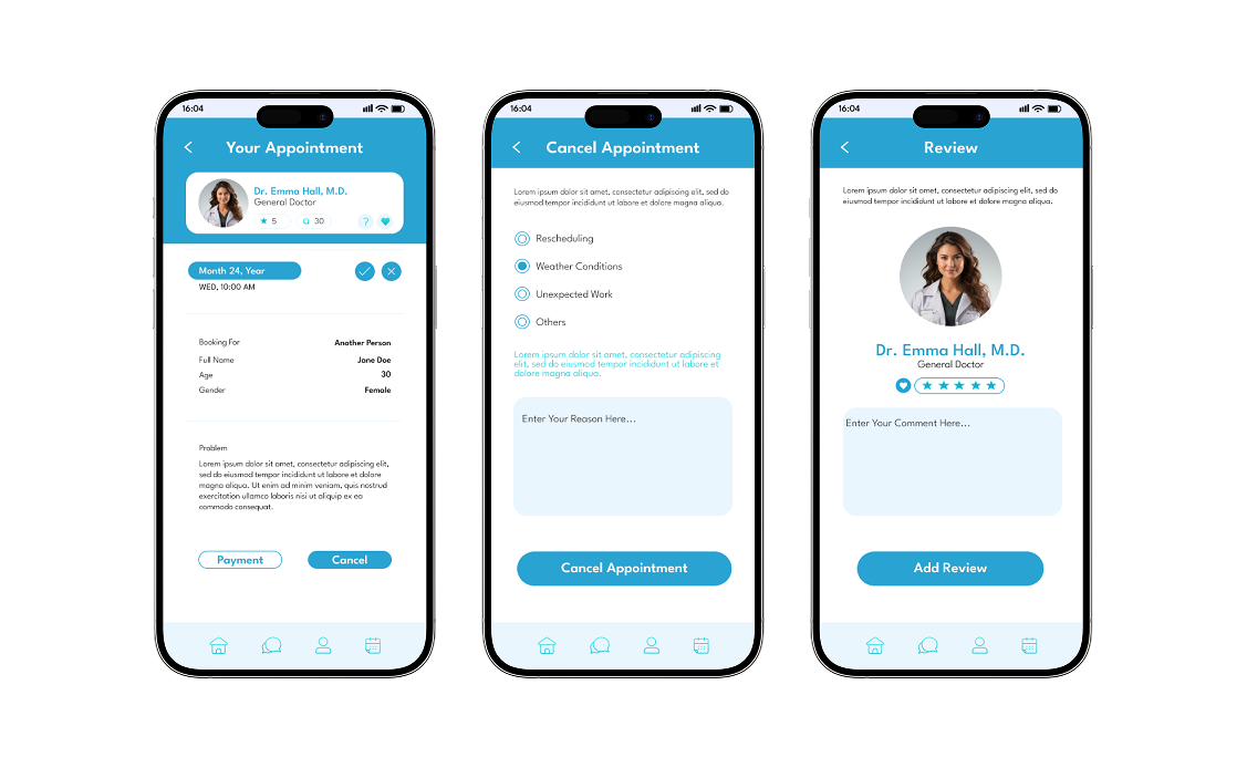
Centralised appointment control
Surfaces edit and cancellation actions clearly to reinforce autonomy.
Summary-first results structure
Presents high-level interpretation before detailed data to reduce emotional friction.
Trust-led visual system
Uses calm colour tones, structured typography, and consistent UI patterns to create perceived safety.
Clear appointment management
.png)
Patients need flexibility without confusion.
1. Centralised “My Appointments” view
Brings all upcoming and past appointments into one structured dashboard, giving patients immediate visibility and control.
2. Visible edit and cancel actions
Surfaces key actions clearly within each appointment card, reducing hesitation and eliminating the need to contact support.
3. Reminder indicators
Uses subtle visual cues and timely notifications to prevent missed appointments and reinforce reliability.
Plain-language medical results, trust-led UI system
.png)
Reassuring Medical Results Experience
Summary-first structure
Presents a clear, high-level overview before exposing detailed medical data, helping patients quickly understand their status.
Plain-language explanations
Introduces simple, human-readable interpretations before clinical terminology to reduce confusion and emotional friction.
Visual health indicators
Uses subtle visual cues to distinguish normal results from attention-needed items, improving clarity at a glance.
Trust-led interface system
Applies calm colours, visible privacy signals, and consistent navigation patterns to reinforce safety and reliability throughout the experience.
Retrospective
Designing for healthcare reinforced that clarity reduces anxiety more effectively than added functionality.
Representative Screens
Retrospective
Test language variations in results explanations
I would explore different phrasing styles for medical summaries to measure which tone improves comprehension and reduces emotional stress without oversimplifying clinical accuracy.
Measure drop-off in booking flow steps
Analysing where users hesitate or abandon the scheduling process would help refine step sequencing and reduce friction in high-intent moments.
Validate reminder timing effectiveness
Testing different reminder intervals and formats would ensure notifications support attendance without overwhelming users.