Premium jewellery brands often lose perceived value due to weak hierarchy and cluttered layouts.
Problem area
Many jewellery e-commerce websites dilute product value through inconsistent branding, crowded layouts, and unclear product structure.
Poor design example

For luxury products, perception directly influences purchase intent.
Products feel less premium
Users scan instead of admire
Decision confidence drops
Weak hierarchy
Design goals
Design a refined, mobile-first shopping experience that:
Elevates perceived value
Create a clean, image-led experience that uses space, scale, and hierarchy to strengthen the brand’s premium positioning.
Guides attention intentionally
Structure layouts and visual contrast so users naturally focus on key products and primary actions without distraction.
Reduces friction from discovery to purchase
Simplify navigation and product flows to make exploration intuitive and checkout effortless.
Design decisions
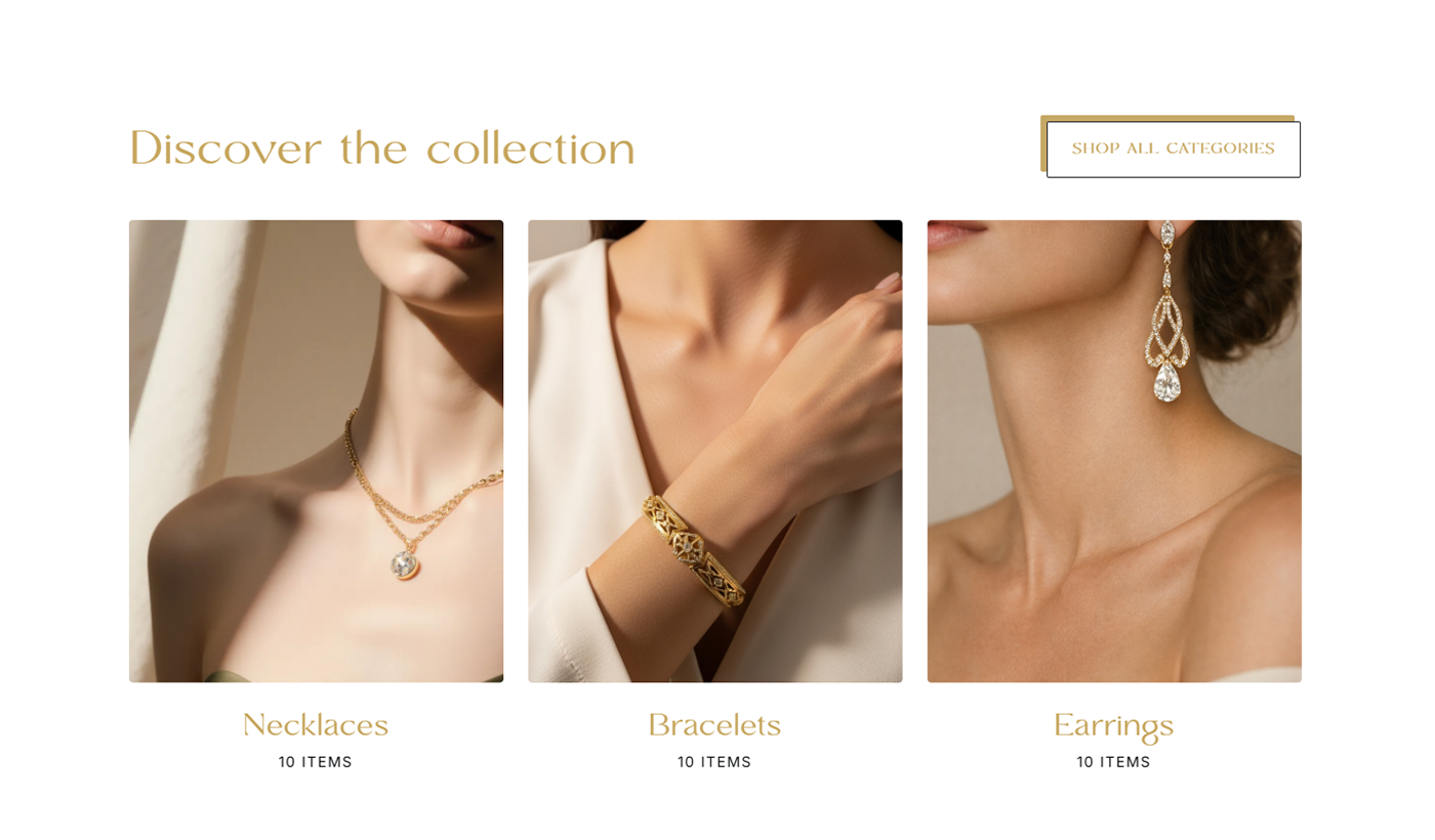
Visual hierarchy over decoration
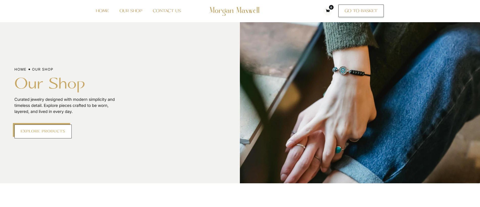
Visual hierarchy over decoration
Strong visual hierarchy
Large product imagery, generous whitespace, and clear typographic contrast were used to elevate perceived value. Scale and spacing create focus and reinforce a premium feel.
Structured product exploration
A simplified category system and focused product detail pages make browsing intuitive. Users can move through the experience without confusion or hesitation.
Clear primary actions
Primary CTAs are visually distinct and strategically placed to guide users toward the next step without friction.
Consistent, trust-led design
A neutral palette with subtle gold accents, paired serif and sans-serif typography, and a consistent component system build cohesion and confidence across the experience.
.png)
.png)
.png)

Implementation
CMS collections for scalable products
Business owners gained control by tracking performance in minutes and making faster, more confident decisions.
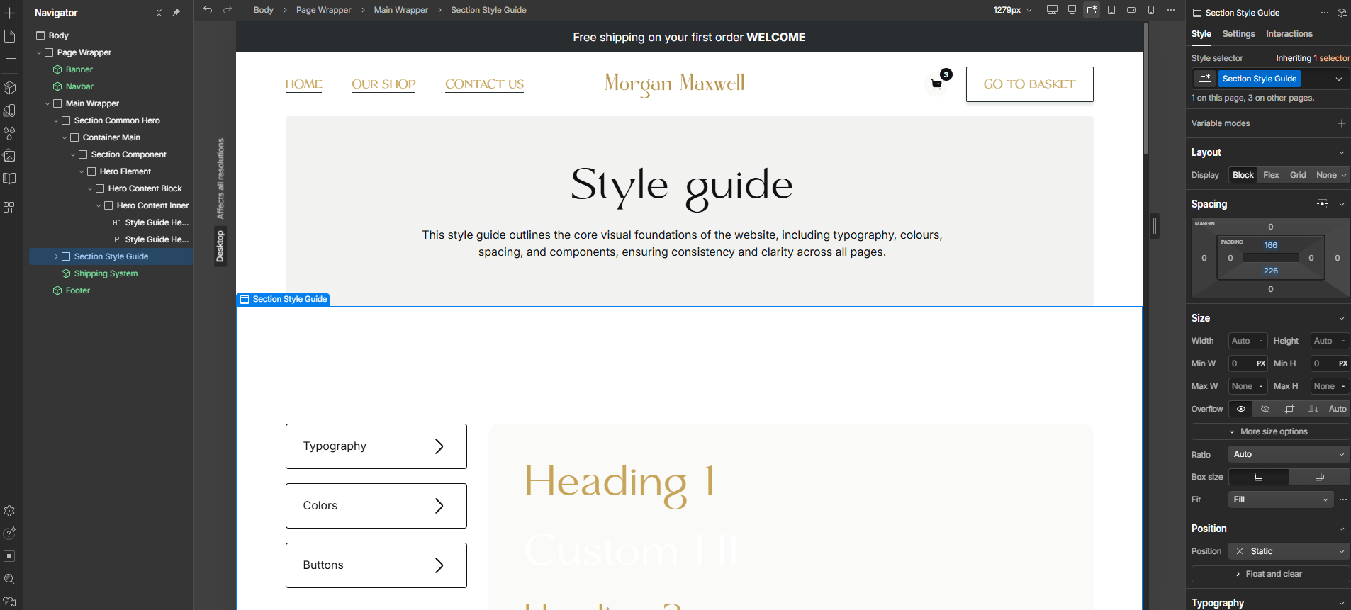
Global typography and color variables
The dashboard became a central product touchpoint, driving engagement and significantly reducing support requests.
Reusable components
The dashboard became a central product touchpoint, driving engagement and significantly reducing support requests.
Fully responsive layouts
It cut design time from weeks to days, letting the team test, refine, and deliver faster.Reduced design cycles from weeks to days, enabling faster testing, iteration, and delivery.
Retrospective
Designing this project reinforced that in luxury e-commerce, restraint drives perception more than feature density. Simplifying structure and prioritising hierarchy had a greater impact than adding visual elements.
Restraint increases perceived value
Removing unnecessary components strengthened the premium feel more than adding decorative elements.
Hierarchy shapes behaviour
Clear structure reduced hesitation and guided users naturally toward purchase decisions.
Consistency builds trust
A unified visual and component system increased credibility across devices.
Luxury requires discipline
Every addition must justify its presence, excess weakens confidence rather than enhancing it.